ADER ERROR
Branding design for Ader Error.

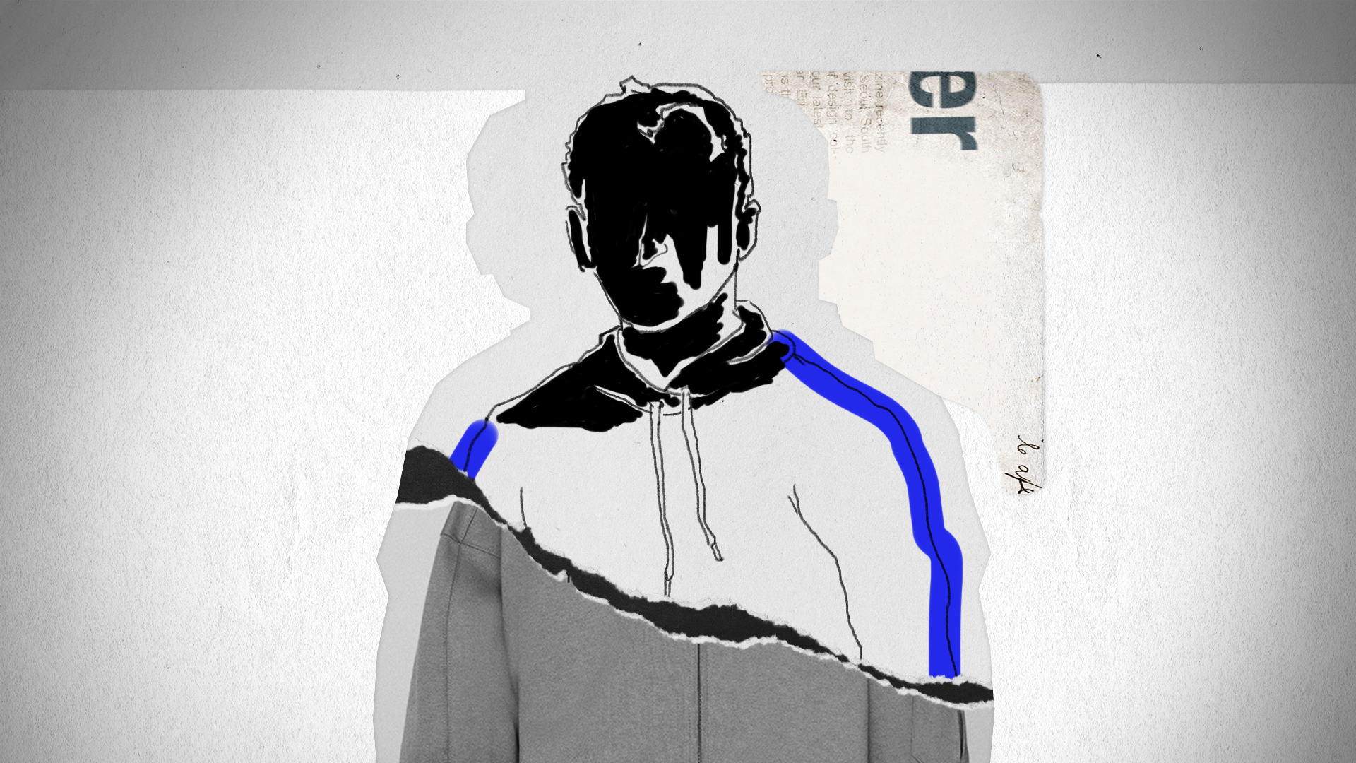
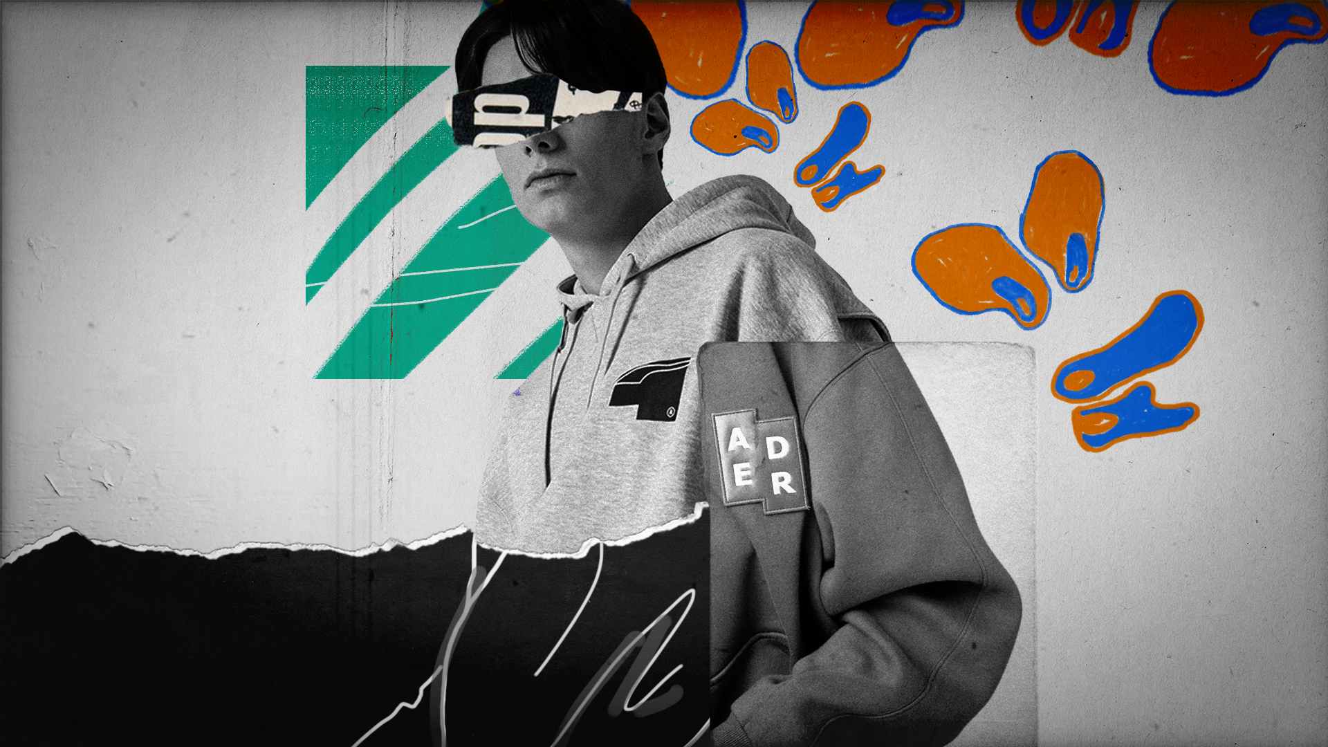
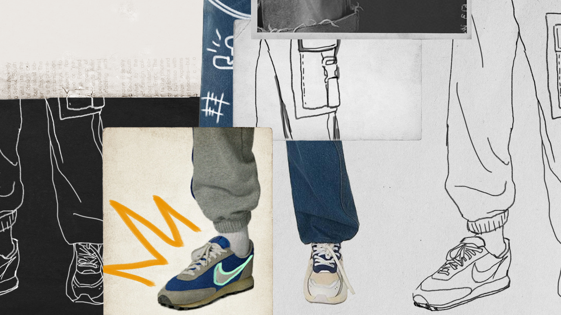
STYLEFRAMES
An anonymous group of people from South Korea who worked in different fields gathered to create Ader Error, a brand that aims to spread art and culture through fashion. Their approach is collective and horizontal, and their main inspirations come from everyday moments as well as imperfection, which they perceive as an attractive point. The brand merges fashion with creativity, using mix-match designs, bold oversized aesthetics, and playful graphic elements.
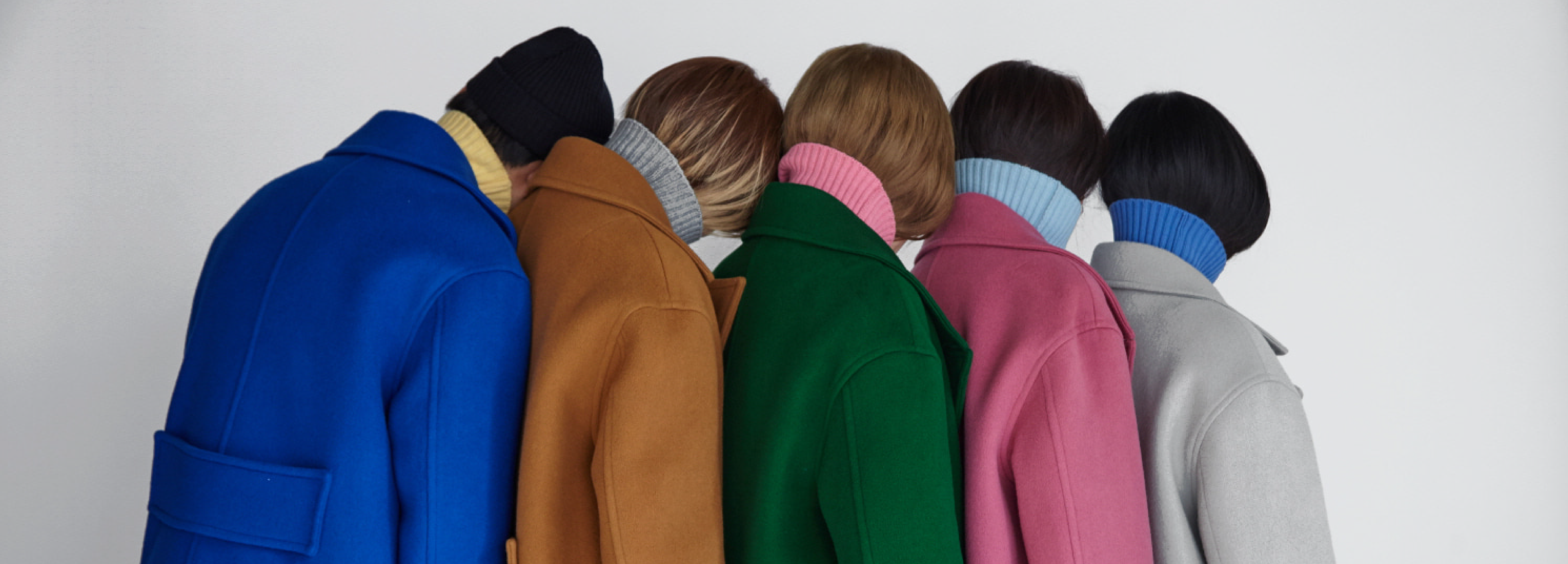
COLOR PALETTE
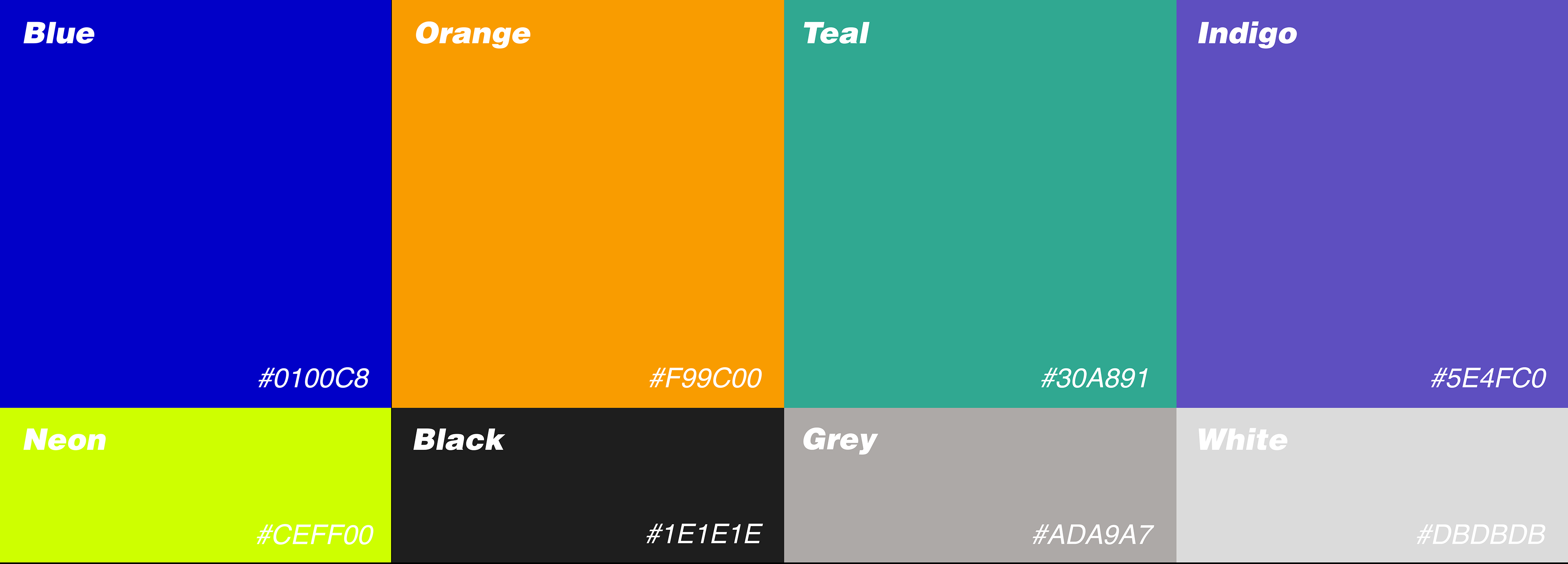
This updated color palette features vibrant, gender-neutral colors that directly resonate with the concept of unisex clothing, which is neither exclusively masculine nor feminine, allowing individuals to authentically express themselves
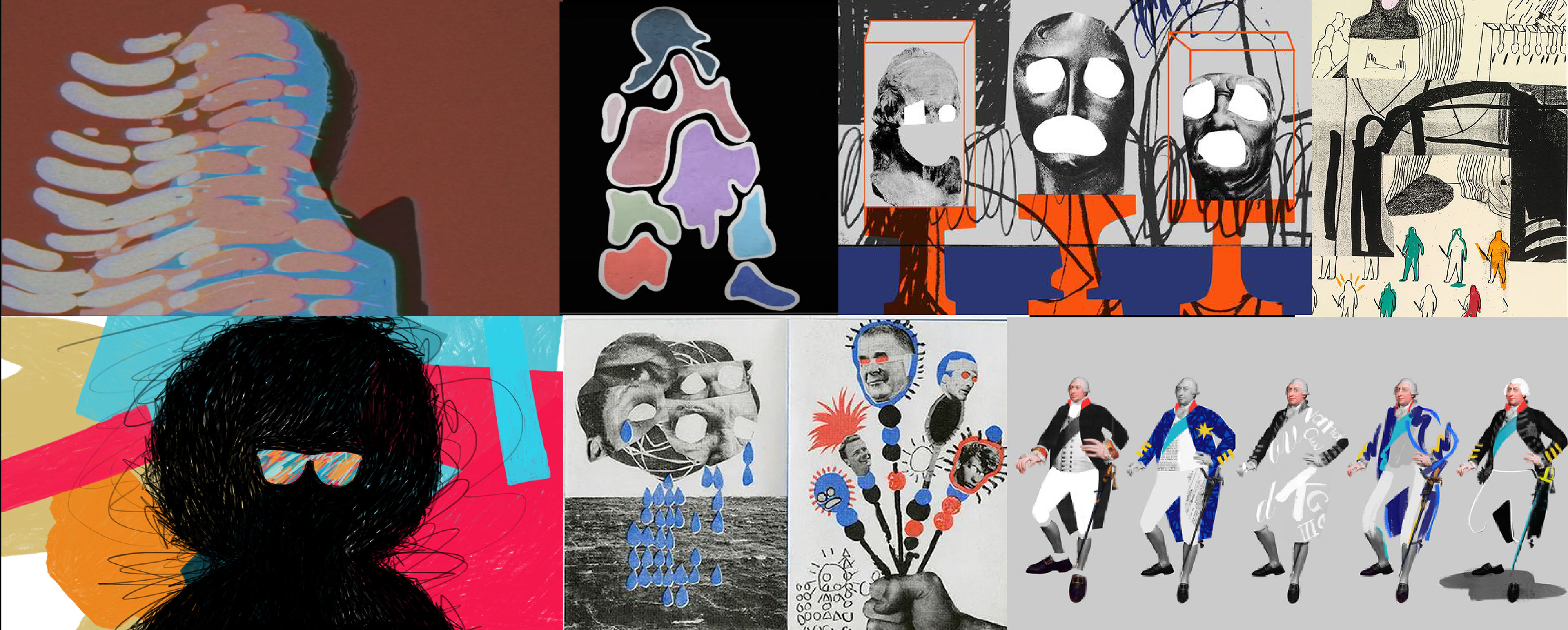
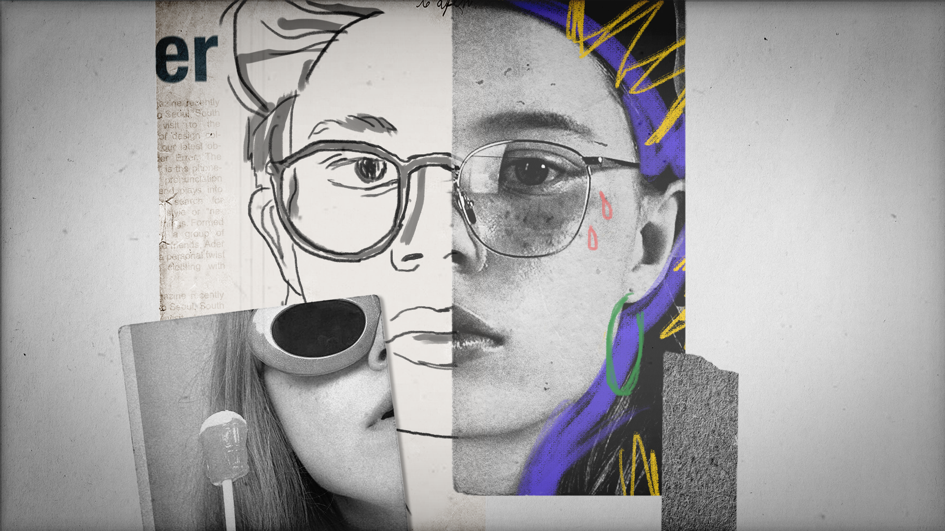
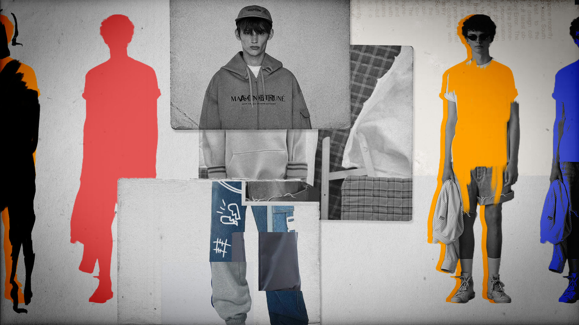
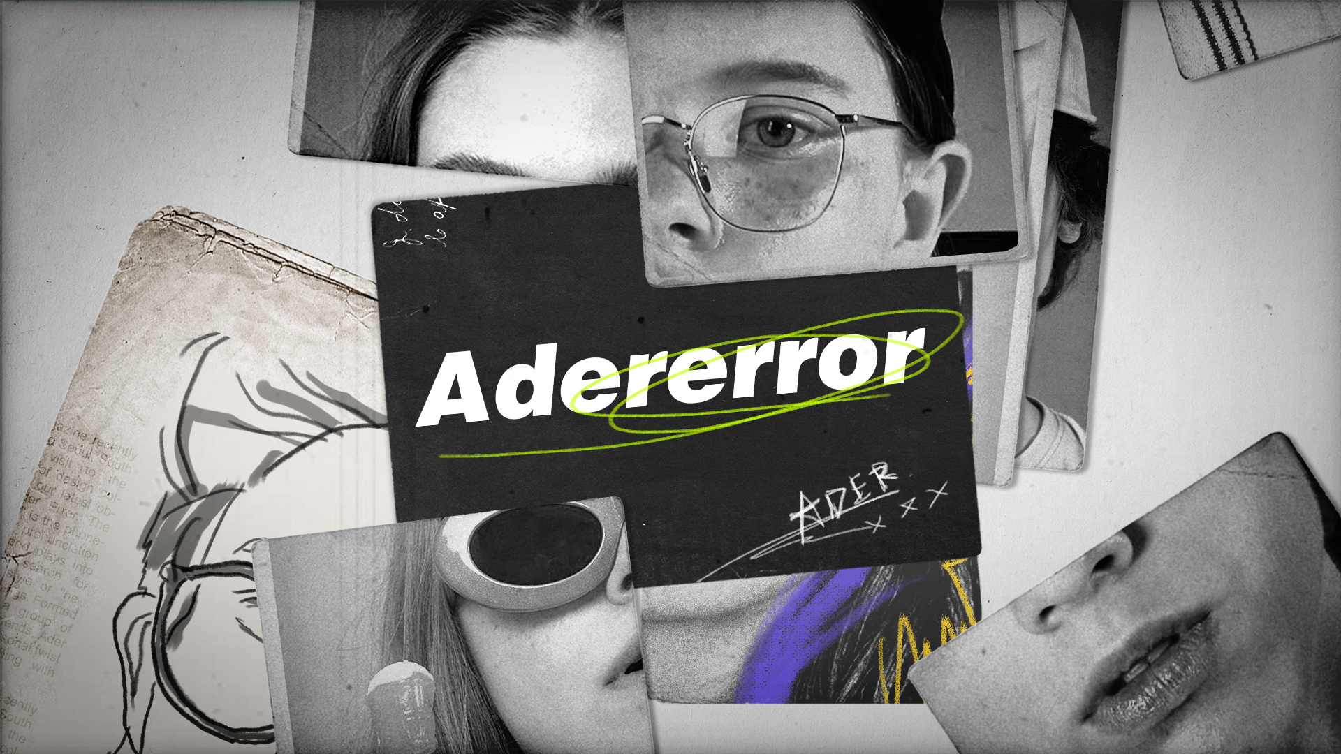
MOODBOARD
This direction speaks directly to the youth which is Ader Error’s target audience. With a combination of hand drawn elements, rotoscoping, collages, and vibrant colors this direction would be designed to capture the energy and playfulness of their audience. These elements also create a raw and organic look which would fit well with their brand as they emphasize self-expression and imperfection.